Hannaford’s Information Design

IMG_0340IMG_0341

Hannaford is the grocery store where I do my weekly shopping. I knew the store had a lot of information posted in it, but I didn’t realize how much until I really looked for it. The most obvious information are way finding and sale signs. Outside the building there’s a “Welcome” sign to tell you where the doors are. The main way finding signs are large signs that label each section of the store and numbered signs at the end of each aisle. Within each aisle there are more signs that label each section.

isleflour

The sale signs range from signs that have specific information about a certain item to signs that are more storytelling in nature that just encourage you to buy nonspecific items. Other signs compared their prices to their competitor’s.

chobaniIMG_0373

beerjello

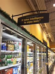
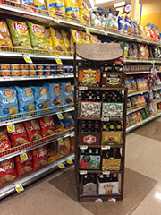
Some of the displays are very attractive and well thought out. It seems like they’re always adjusting the displays so they’re well taken care of. One of my favorites is a wooden display for a variety of beers. Other displays are not attractive at all and strictly functional.

IMG_035650off

In addition to the way finding and sale signs, there devices and signs to help people find and garner information. Just inside the doors there is a Customer Service kiosk where question can be answered. Throughout the store there are information centers where people can scan items for information or call someone for help.

serviceIMG_0351

There’s also signs for legal notices, expected behavior of customers and just information about the environment of the the store. I appreciated this sign about the LED lights in the freezers when I walked down the aisle and all the lights in the cases went out at once. It was nice to have an explanation.

ledIMG_0376checkouttrespassing

When I really looked at all the that’s presented in the store, it became a little overwhelming. I wonder if this is why I’m mentally tired at the end of a shopping trip. Even though the information is overwhelming when I look at all of it, I’m glad it’s there. The store is design well and really well thought out.

push

My favorite piece of information design during this trip was this handwritten sign on the bottle return machine. I wonder how many people complained that the machine wouldn’t give them a bottle return slip before they thought to put this sign up. Gorilla style information design at it’s finest.

Photoshop for Information Design

tools

The tool that I’ve used the most while creating my blog entries is Photoshop. I’ve used it to edit photos and create graphics to use in my blog. Although the primary use for Photoshop is photo editing, you can also use it to create infographics and concept maps.

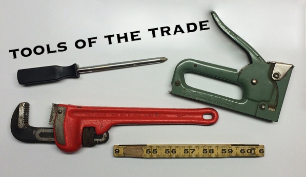
Since this entry is about tools, I thought it would add interest to have a picture of some tools. I went down to my basement, picked out a few tools, photographed them on on top of the dryer using my phone, and up loaded the picture to photoshop. From there I cropped the photo, cleaned up the reflection on the dryer a bit, adjusted the brightness, and added some text. In just a few minutes I was able to edit my rough photo into a clean image that conveys the message I want it to.

Here’s the original photo for comparison:

IMG_0298

Piktochart for Designing Information

Visual aids are effective tools to use while presenting your ideas to other people. They help keep your audience engaged in your presentation and help illustrate your ideas.

Piktochart is a great tool you can use to create infographics for all kinds of information design projects. There are several free templates to choose from to create infographics, reports, banners, or presentations. Along with the free themes, they also offer several “pro” themes for a fee. If you don’t want to use a template you can always create something from scratch.

Creating an infographic is quick and easy. You just pick a theme, choose a background, then select appropriate icons, charts, maps, and photos from Piktochart’s immense library. If you can’t find what you’re looking for in their library, you can upload your own media or request they add a new icon to their library. You just describe the icon that you need and their designers will make something for you. All for free! You can even add videos to your project if you want.

Here’s an infographic I made about the process of visual thinking:

visual-thinking

Information Design Process

info

There are several steps to consider during the process of creating effective information design.

First step – Information Gathering

It’s important to gather pertinent information about the project by asking preliminary questions such as:

  • Who is the audience?
  • Where will the information be displayed?
  • When is the project due?
  • What is the goal of the project?
  • Why is the information important?
  • How will that goal be reached?

Second Step – Create a Creative Brief

Now that all of the preliminary questions have been answered, it’s time  to organize that information by creating a creative brief. A creative brief should contain all of the information garnered from the first step, as well contact information for the client and everyone working on the project. The creative brief  should outline the pertinent information and the goal of the project so everyone is on the same page.

Third step- Persona and Scenario:

The third step is to create an imaginary user called a “persona” and a scenario of how the imaginary user will use the information the team is designing. Information designs main goal is solving an information problem in such a way that it’s most useful to the user of the information. Creating an imaginary user and a scenario is the best way to make sure the user’s needs will be fulfilled.

Fourth step- Prototypes and Testing:

The last step is to develop a prototype so the design can be tested by a potential audience. This step takes the persona and scenario idea from the third step one step further by using real people and situations. The information garnered from the test audience will help the design team hone the design to the most useful version for the end user.

By following these steps, information designers have the best chance of developing an effective design that will best serve the needs of the user. Although all the steps are important, I find that the first step is key. If you don’t take the time to ask these preliminary questions, you run the risk of steering the design in the completely wrong way. This not only wastes time, but potentially does your client and the audience a disservice by not considering their needs. This is the step that I focus on while creating a blog entry.

Information Interaction Design Theory

According to Nathan Shedroff, “the most important skill for almost everyone in the next decade and beyond will be the ability to create valuable, compelling, and empowering information and experiences for others.” Shedroff’s theory is that a user-centered approach incorporating information design, interaction design, and sensorial design is the best way to achieve this goal.

Information design, as we know, is the practice of organizing data and transforming it into meaningful information.

Interaction design is the practice of creating a compelling story that engages the user through interactivity. Interaction can be passive, such as reading, watching a video, or flipping through a slide show. Interaction can also be active such as using digital products or navigating a website in which the user has more control in shaping their experience.

Sensory design incorporates the use of senses such as sight, sound, and touch into shaping information. These principles can be implemented through, pictures, videos, and even how buttons or controls on an electronic device feel.

Combining these three elements creates valuable, compelling, and empowering experiences.

Some of the pros of this theory are that by creating a pleasant experience for the user, information is absorbed in a more effective way. By engaging the user in the process, it becomes an experience with a payoff of knowledge. Through interactivity the user is afforded a higher level of contemplation, evaluation, and interpretation that allows for the opportunity to find wisdom.

I found a successful implementation of this theory during a recent trip to the gym. The picture below shows the remote for the TV on the elliptical machine I was using. The little picture of the headphones at the bottom is so simple, but it conveys so much information very quickly. First, it alerts the user to the existence of a headphone jack. Next, it shows you where to find it with the little arrow pointing down. By engraving the picture into the machine it employs sensory design. Once you know basically where the jack is you can feel for the engraved headphones while plugging your headphones in instead of continuing to look while you do it. The fact that the headphone jack is at the bottom of the remote helps create a pleasant experience because it allows the headphone wire to hang nicely and not get in the way.

interaction win

Some of the cons to this theory are that some people don’t want to take an active role. Some people prefer to be passive. Slide shows are an interactive media that people don’t like if the information can effectively be conveyed on one page. So, another con would be poor implementation of the theory. If you’re going to have people interact with media there needs to be a meaningful reason behind the interaction or you run the risk of people feeling that they’re being made to jump through hoops. Nobody likes that feeling. If interaction design is poorly implemented on a user interface, the user’s experience can be soured too.

During another trip to the gym I had a poor experience on a different elliptical machine with an ineffective interface design. The two buttons in the picture below are very close to each other, they are similar in size, and they feel the same, but they do very different things. The one on top toggles between three different information items, while the bottom button stops the machine. I wanted to press the top button to toggle through the information, but I accidentally pressed the reset button and stopped the machine. Definitely not a pleasant experience! Placing these button further apart would prevent this from happening.

interaction fail

So far with this blog I have only implemented passive interaction such as text and pictures because they seemed like the most logical way to present the information so far. In the future I plan to use video and slide shows when it is more appropriate to do so. The final blog topic, critiquing information design in a public space, will be perfect for video and/or slide shows.

Reference:

Jacobson, R. E. (1999). Information design. Cambridge, Mass.: MIT Press.

What is Information Design?

wyoming

State signs are an excellent opportunity for states to let their personalities shine through while conveying information.

Information design is the process of transforming data into information that is presented in a way that is clear and easy to understand. Information design involves collecting, organizing, and understanding data, so that a plan can be made to design and present the information in a way that best suits the need of the user of the information. Being a graphic designer, I always want to jump right in and start designing. The problem with that is that there’s no point to creating a design until you know how the information will best suit the needs of the user. The answer to that question comes during the research and organization phase.

jockeylane

Here’s an example of how information design helps the jockeys at Saratoga Raceway navigate the path between the track and the jockey room quickly and efficiently.

Information design is all around us. It helps us navigate the world through road signs and maps. It helps us explore and enjoy public spaces such as museums, parks, and malls through the use of signage. Websites, books, pamphlets, and forms all use information design. Information design can even be found on prescription bottles and product assembly directions.

badinfo

Sadly, there is information out there that is in desperate need of some design attention.

In short, wherever there is information, there is an opportunity to design it.